We Are Moving
If everything goes to plan then within the next 24-48 hours we are on the move. Back when dinosaurs ruled the earth (August last year actually), we asked you to select a new theme design for the site. We have now (eventually) implemented it, which you can have a sneak peak at here.
Due to the wonders of the world wide bubble while the site is migrating over you may experience some down time and/or the old (this) site still showing up in your browser. This will only occur for a short while until DNS propagates around the net.
In the meantime do have a look and leave your comments about the new layout, both good and bad below.
Share this WHS Article with Others:


Things I like:
* I like the way you’ve organized things with everything in labeled boxes. It makes it easy to find things compared to the current layout where the left and right columns are just “busy” and harder to read.
* Commenting looks better.
Things I don’t like:
* The top logo looks crowded and messy. I’d like a neater “web 2.0” logo with a smooth gradient, san-serif font, etc.
* The new layout is a fixed-width so on my wide monitor, the left and right are unused. The background is a repeat of parts of the top logo and again I don’t care for it much.
* Page is giving a JavaScript error in suckerfish.js
* I miss the blue which was soothing to the eyes.
* Contact and Forums pages don’t work correctly
* Where’s your MVP logo?
Nice, great upgrade!
Can you just image is any website stays the same, it would look like the 1920’s or 1930’s around here. He He.
cough, cough, expcept for google, cough.
I have to agree with WHS fan in a few ways. The logo is way too busy. Same with the background on the site. The background needs to be atleast half as light as it is or gone. The site is way too cluttered. I personally like the look of the current site. I can understand you might want to make it more “current” but it the new version just looks busy and chaotic.
Hey Phil, I like the look and having my own site, know exactly what a pain it’s going to be! I spent the long 4th of July weekend to switch to my new theme which seems to be working out quite well! Anyways nice job.
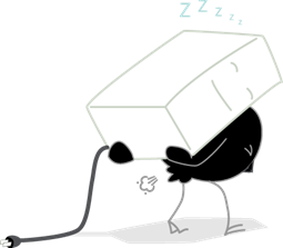
Oh, and BTW, has anyone else but me noticed that the bird or whatever is carrying the computer just busted ass? LOL!!!!!! Too funny man! Did you draw that? 😉
Tom (a.k.a. Billy…the Badass is implied)
In some ways the new look is cleaner – especially regarding the left and right columns being gone.
The background is distracting though and not symmetrical between the left and right hand sides of the page.
I don’t mind the green but if that is the theme for the new site then its quite pale for the text elements. I would like to see the text elements a little larger as the green doesn’t stand out quite enough on the white background.
I really don’t like the three whips that are part of the background and especially the logo where they serve to obscure reading.
The green bar across the top is a great improvement on the current navigation as is the overall layout.
The blue and green for MS WHS looking like it is trying to hard IMO the blue is more dominant than the green too and the italic text beneath the logo is hard to read and should not change colors IMHO …
Organization is better overall but colors and branding need more work I think
The logo is better, but I would still recommend getting rid of the gray swooshes (grass?) and the extraneous smattering of shields behind. I’d also remove the gray grass swooshes in the main background.
Just launch the thing Phil!
🙂
Andrew